I honestly don’t know what to think about it.
In one hand, indeed the old login screen was a bit out-of-touch with modern era. I don’t remember it changing ever since I got married (so to speak), which means it’s almost 10 years since it last changed significantly. In a way, it’s kind-of odd how almost every other Google interface grew and changed with the times, just not the login screen.
But… I don’t know. What they pulled just feels off. Like it’s incomplete, or a WIP, not something that is ready for Production. Here’s how the desktop version looks like:
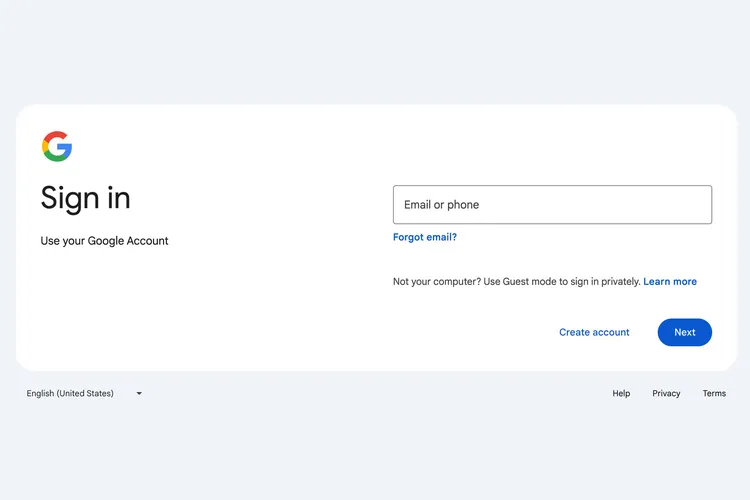
Now, it’s been around 8 years since I worked as a designer, but I still remember a thing or two. For example, there is just too much blank space under the “Use your Google Account” text. There is a seemingly random top margin above the “Email or phone” which is not aligned with anything. So you get clusters of items (Google logo + “Sign In” + “Use your Google Account”; login form, “Forgot email?”, disclaimer and buttons) that look fine per-se, but they seem to be unbalanced between them.
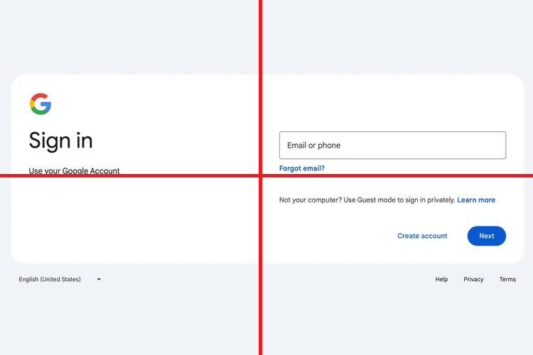
By dividing the image in quarters you can understand better what I’m saying. In the bottom left corner you have a single selector for language (1 element), in the top left you have the logo, a header and some text (3 elements), the top right contains a form and a link (2 elements), and the bottom right quarter concentrates a lot of elements: a disclaimer, 2 control buttons, and then 3 external links – this could be either 3 elements or 6 elements depending on how you count it.
I’m not too sure of what to think about the hierarchy in there too. What first drew my attention the very first time I saw it was not the text input, or the Google logo, but the white space as mentioned before. Though this could be muscle memory: as the old login screen did concentrate the input fields right in the middle of the screen, maybe I was unconsciously expecting to see that instead of this new horizontal-oriented design.
When you have to select between multiple accounts, I think that the old screen did it better too – now you have those small selectable items instead of the big, centered and visible list there used to be before.
(I’ll post a picture of this tomorrow.)
I don’t think it’s bad; I think it’s unfinished. I think the login screen was indeed overdue for a change, but maybe it needed more acceptance tests, or maybe they should have just given the designers more time to play around with ideas, both new and (refurbished) old ones. Maybe that could serve as a testament to a philosophy that’s becoming more prevalent in software engineering: that an MVP needs to be put out as soon as it’s functional. I’m not going to discuss that here today, but I find it odd that a company like Google would operate like that – they are not a startup run by a team of 2 or 3 developers who’re trying to get their bag with a “$” written in it from venture capitalists.
I have a coworker who has observer that this is a multi-stage login – that is, first you put in the email, which goes through validation, and only then the password. Which I partly subscribe to, as it is an UX I don’t really like in login screens, but I can understand the rationale for it; if Google can first check if the email is valid/exists/passes validation (which is “easy”), they have less passwords to verify, which can be a relevant optimization when your servers are getting millions of login requests every minute.
Anyways, I’m just overthinking at this point, and this certainly does not negatively affect my life in any form. It’s interesting to think about though – maybe this will trigger a bunch of login screen redesigns from big and specially medium sized companies? I’m actually quite fascinated by the design of login screens (it’s one of those weird things you’re sure only you are interested in – everyone has them), so 2024 might be an interesting year in that sense.
Disclaimers: I have not seen the mobile version of this page yet so I have no comment in that. Also, as this is a personal blog, I don’t think I even have to explicitly state that this is all a matter of personal opinion/taste and in no way an attack against the designers and developers in Google or the company itself. But it’s now stated explicitly anyways.